
Multi-view Scheduler
Overview
Infor Multi-View Scheduler (MVS) is a tool for scheduling managers and other staff with similar responsibilities. Partnered with our product team at Workbrain, we were tasked to redesign the MVS tool within Infor's Workforce Management product. For the purposes of this project we focused on how the tool is used to plot and assign Licensed Nurse (LN) and Licensed Nurse Practitioner (LPN) rotations.
Role
UX Research, Information Architect, UX Design, Prototyping
Client
Hook & Loop – Infor, Inc.
Tools
Sketch, Omnigraffle, Adobe XD
Challenges of limited scope
The scope of the project was limited to a small section of the Workforce Management platform. This affected how we approached the planning and concepts phases of our design process and ultimately our final solution. Because the initial scope of the project was already established before my team was brought on, the deadline was already set before we started conducting our user research.
User Research & Heuristic Evaluation
Working with a user researcher, the team and I conducted remote user interviews with three different organizations using the current MVS tool. The purpose of the interviews was to gather more information about the users, what their role was in their organization and their day-to-day processes. Using WebEx we watched and listened to each user as they walked us through their installed version of MVS and asked them how they would go about completing certain tasks. This gave us insights on the platform such as pain points, technical issues or limitations, and workflows, which we then used to create an affinity diagram. Our research showed that Nurse Managers used the tool the most and so that became our user persona.
During this time I was also building a heuristic evaluation of the current software to identify major and minor usability problems in the UI. I later used this document as a reference for further design improvements. View document
Affinity Diagram (plotted in Excel)
Production
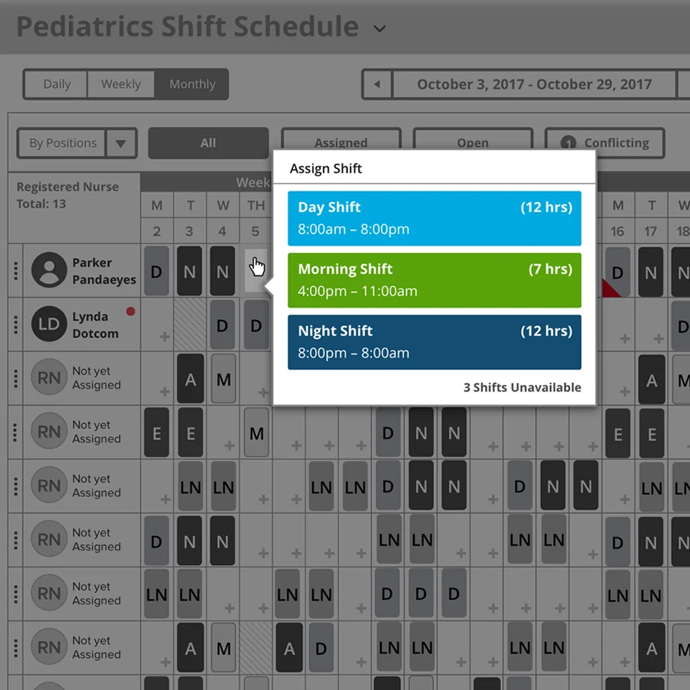
Once the team and I presented our research findings and recommendations to the product team we started to conceptualize process flows and sketching initial layouts. Some of the problems I aimed to solve with the new designs included: Fitting up to 4 weeks on a standard laptop-size screen without horizontal scrolling, minimizing the number of modals that appeared when creating/editing a schedule, and elevating relevant information "at a glance" without having to dig for it. I focused on making the schedule feel and act like an Excel sheet since a lot of the users we talked to still relied on manually entering data into spreadsheets. Clicking into a cell displayed a tooltip with additional actions the user could take as to make add, deleting and editing individual shifts quick and efficient. Relevant information is displayed in the right side panel and updates depending on which cells, rows or columns the user has selected.
Conclusion
At the end of the project I delivered a clickable prototype that branched off into the 3 different scheduling scenarios we designed. Even though this project had very limited scope and we weren't able to come up with a holistic solution for the entire experience, our extensive research informed the product team on some of the bigger issues and opened the door for future collaborations with Hook & Loop.